Star Trek Group Logo Poll - Elimination Round


This is the elimination round.
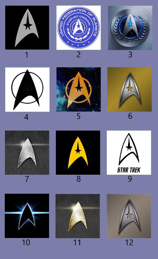
I have numbered the choices and compiled them into into a single image for ease of posting.
The logo being used right now (above and to the right in the 'sponsored by' box) is number 10.
The poll ends Friday at midnight Eastern.
The 2 most popular choices will advance to the final round.
Select your choice for the Star Trek group logo
Don't forget to hit the Vote button after you choose
Resistance is futile
Voting has Ended
Select
Option
Votes
Image 1
0
Image 2
0
Image 3
5
Image 4
0
Image 5
4
Image 6
0
Image 7
0
Image 8
0
Image 9
1
Image 10
6
Image 11
1
Image 12
0
Tags
Who is online
103 visitors
I originally intended this to be for Star Trek group members only, but I see no way to do that with an open group, so what the hell...
Vote away, people. Member or not.
However, if you're not a group member, but you like Star Trek, then why not pop on over to the group page and join?
A little trivia: the ST delta emblem is based on the non-cannon Star Trek book, Federation (1994), where Zefram Cochrine explains in a simplistic way of how warp drive works.
Was the explanation something like one side contracts, and the other expands?
How could it be based on something from 1994, though? The original crew wore it in the 60's.
Zefram came up with it before TOS, as part of the book describes past events with regards to Zefram's life. Some events in the book happen before Ze "disappears." The book does reference his appearance from TOS though and explains what happened after that episode.
He drew the familiar insignia shape as he was explaining light speed principles. Basically, starting from the bottom left point, he drew the left line up to the top point, saying as one nears light speed, the energy required to propel mass to light speed becomes infinite (the tip of the triangle). After that, the energy requirements to maintain light speed drop off considerably. That's demonstrated by the right side line from the top point to the lower right point. Now, using warp fields to create a "bubble" around a ship to effectively lessen it's mass, the energy required to reach light speed is vastly reduced, which is represented by the curved bottom line of the insignia connecting the bottom left & right points.
Thanks. I thought you were suggesting the emblem came from that book in 1994. Not the story of how it came to be inside the Star Trek universe, but the actual thing we saw Kirk wearing on his shirt in the 60's. Obviously, that wouldn't make sense.
ST First Contact contradicts some of the backstory presented in the book. Of course, FC is considered canon whereas the book is not. But the book does present an interesting account of Zeframs life before & after his appearance in TOS.
Cool choices.
Good one!
I'd say which i picked but there are people here who would probably not vote for it simply because i did.
Lol I know it wasn't the one I voted for, since I'm the only one that's voted for it so far
Ha, great mimes think alike, lol.
I think 3 looks too much like an "easy button",
10 looks like it was just hit by a phaser from behind
which left me with 5.
Looks tactile, good shape, color and cut out on a great background with the universal ring of an orbit.
( I know, not all orbits are round ).
That made me chuckle. I hadn't thought of that.
I kind of like the stark, glowing contrast, though.
Never thought of that, to me it resembled that flash of light you see when a ship goes to warp
This is fun! I voted for my fave.
My choice is overly-adorned, but I swear if you tilt your head you get visual contrast.