Montana library commission rejects logo because it looks too much like a rainbow flag / LGBTQ Nation
By: Alex Bollinger


A proposed logo for the Montana State Library was rejected last week because several members of the commission that oversees the library thought that it was too gay.
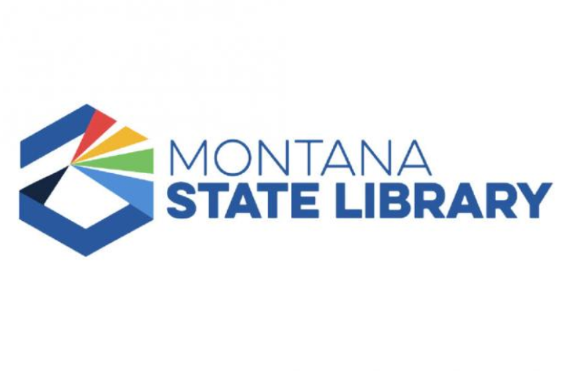
The proposed logo is mostly blue and shows a hexagon and the name "Montana State Library." In the hexagon is a black triangle on the left and four more colorful triangles on the right in red, yellow, green, and blue, representing a prism. The prism represented "information being trumped forward," according to the AP.
But some members of the commission thought that that looked too much like a rainbow and rejected it in a 4-3 vote.
"I think there are two things you can say today to set off a firestorm in the area of information," said Commissioner Tammy Hall. "One is rainbow and one is misinformation. Those are very political, explosive weapons."
The advertising agency Hoffman York, which created the logo, said that they were also worried that people would think the logo is a Pride symbol and that's why they made the colors more muted, "to avoid the suggestion of it being some sort of Pride mark."
Moreover, the logo only has four stripes, whereas the rainbow flag has six, including an orange and a purple stripe. Commission chair Kenning Arlitsch said that he thought it was "a stretch to think that this represents a Pride flag."
LGBTQ advocates in Montana are not amused by the state library commission's anti-LGBTQ sentiment.
"If you're going to have a problem with a logo and the first thing that you think is 'Oh, it's got bright colors and that's a little too queer for me,' you're a bigot and you have issues," said Montana Pride president Kevin Hamm. "Don't throw my community under the bus just because all of a sudden rainbows make you think everything's gay."
Hall said that she was "sorry that became such a big issue" but she is worried about how the logo is part of the library's larger rebranding efforts and thought that it might hurt the library's funding since Republicans control the state legislature. She suggested making the colors gray and black to make it even less gay.
Others in the commission said that they liked the logo since they thought it represented the work they do in archiving information and presenting it to the public.

Tags
Who is online
49 visitors


Now I am sure of it. We are a nation of idiots...
If not now we are well on our way to that position.
you're definitely surrounded by them in any red state...
[deleted]
Thanks for proving my point...
LOL
You want the Library to be all inclusive? Then it can not be shown to favor any group or party.
Good luck with that; because someone, somewhere, in someway will see something that isn't there; and is not intended.
Seems to be what these people are doing...
Libraries are usually all inclusive until the morons start deciding to ban books.
trumpsters in libraries, ha ha ha, that's a good one...
This is not a problem. All they had to do was change the shape.