FROM COLOUR TO BLACK AND WHITE
Notwithstanding the reversal of that direction that progress has created, sometimes black and white better illustrates the photographer's intent and/or better directs the attention of the viewer.
Many years ago black and white photos were much more common than they are today, no different than with movies. One reason may have been cost, another ease of processing in home darkrooms, or the limitations of yesteryear's colour reproduction. But today digital cameras have almost totally eclipsed film, wherein colours are considerably better displayed. Most of today's digital cameras are set for colour (some do have the feature of a setting for taking photos in B&W) but usually removal of colour from the photos (de-saturating the colour) is done by means of computer progams once the photos are downloaded (or is it uploaded? - I could never figure that out). In this article you will learn some of the reasons why we de-saturate.
I posted this article eight years ago on the Creative Arts group, and thought that since it was most likely seen by very few of today's NT members, perhaps there are now others who might benefit from it if they spend any time at all on photography and would like to improve their technique. I have made some additions and amendments to the original article.
The following paragraph was the introduction to the original article.
Taking the lead from A.Mac, whose concept was a revelation to me, I have gone through some of my colour shots and de-saturized them, while also gearing up the contrast for more distinct delineation between the darks and lights. For each photo I have posted first of all the original colour shot, followed by the B&W created from it, explaining my feelings about what was accomplished by doing so. Thanks for that idea, A.Mac. You have opened up a whole new avenue for me to play with.
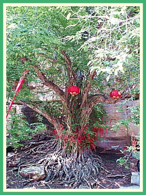
1 (a) This is a 1500 year old tree. The red banners and lanterns have been hung on it for good luck (not for the tree, but for the persons hanging them).
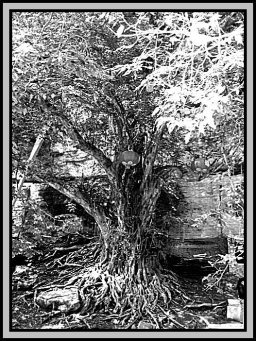
1 (b) Lacking the distraction of the red hangings, the focus is now on the tree itself. in particular the Medusa-styled roots.
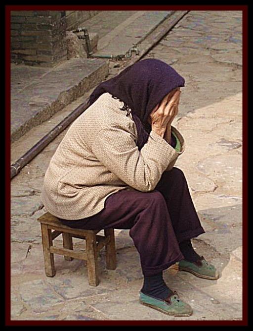
2 (a) Despair personified, but the colour reduces the depth of the despair.
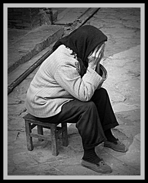
2 (b) The absence of colour accentuates the emotion. It was not until recently that I came to the realization that the subject may not have been experiencing despair, but noting her head scarf could be a Muslim who did not wish for me, a male person, to see her face.
3 (a) Because of its vivid colour, the boat is the primary focus when you view this picture.

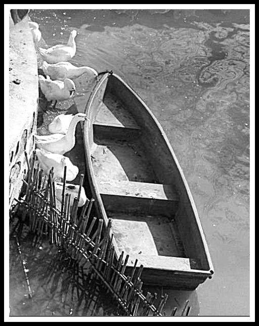
3 (b) Your eyes turn quickly to the geese in this case, arousing curiosity as to what they are doing.
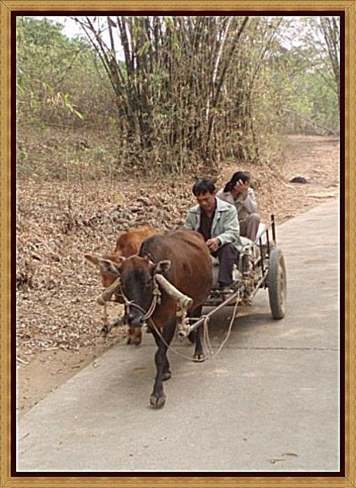
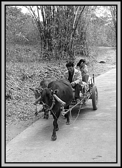
4 (a) One might think I took this photo in the wild west, but it was in a small park behind a museum in Nanning, Guanxi Autonomous Region near the south of China.
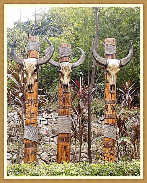
4 (b) In this case, the better photo is probably the colour one, because it is difficult to make the subject stand out from the background without the benefit of contrasting colour. A heavier hand on the contrast and a touch of saturation was necessary here.
5 (a) Colour makes this photo current but that does not match the subject, which is retrospective.
5 (b) Now this definitely looks like a much older photo, taken perhaps in the 19th century, which is a better context for the subject matter.
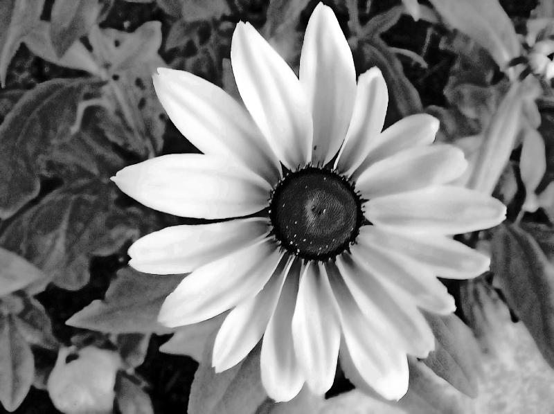
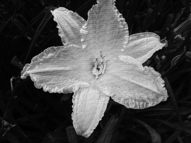
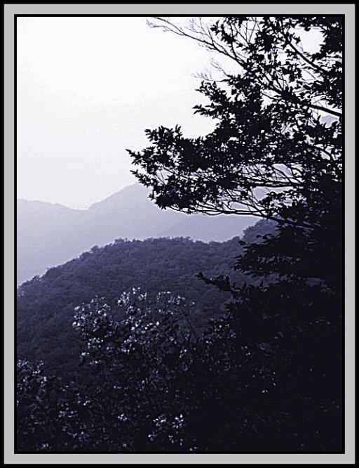
6 (a) In this case, colour does provide good contrast against the mist (pollution?). Your focus is on the flowers.
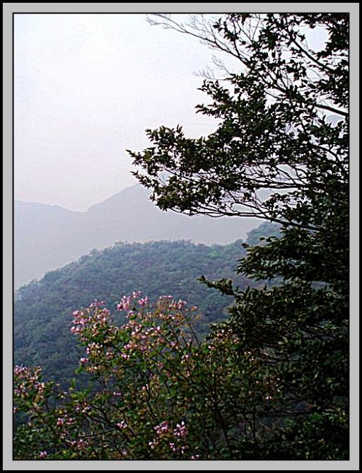
6 (b) Now it is more probable that your eye is drawn past the flowers to the distant hills shrouded in mist.
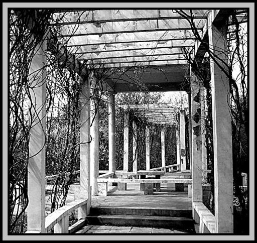
7 (a) What appears most attractive here could be the pink-flowered bush.
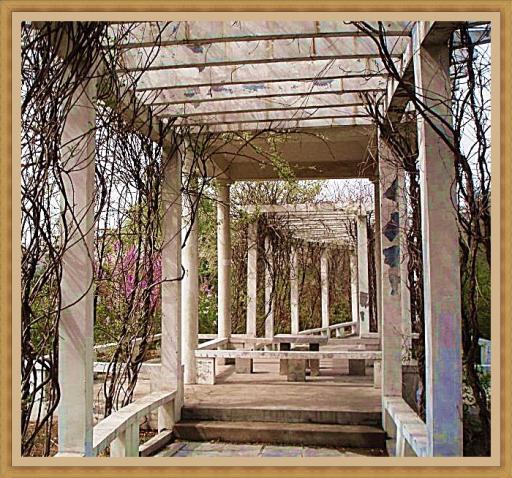
7 (b) Now the structure and the vines are the main focus, without the distraction of the flowered bush. So the transition of the photos from colour to black and white can make a considerable difference, virtually changing the perspective and concept.
8 (a) That (no. 7) was not the best example of erasing a distraction. In this photo, the bright blue colour in the upper left corner is most likely the first thing to which your eye takes you.
8 (b) By de-saturating the colour the distraction is eliminated.
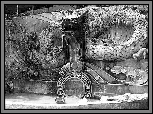
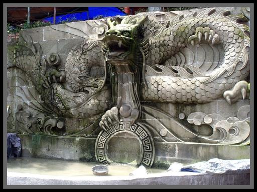
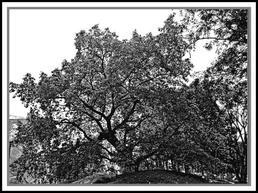
9 (a) A further example of eliminating a distraction, which is behind the tree on the left, may or may not be desirable...
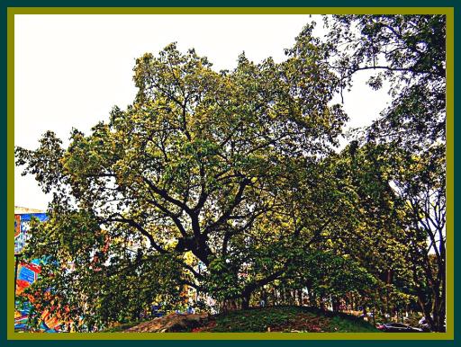
9 (b) ...because eliminating the colour in this case also eliminates the prominence and beauty of the tree itself.
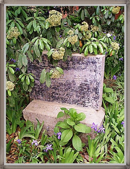
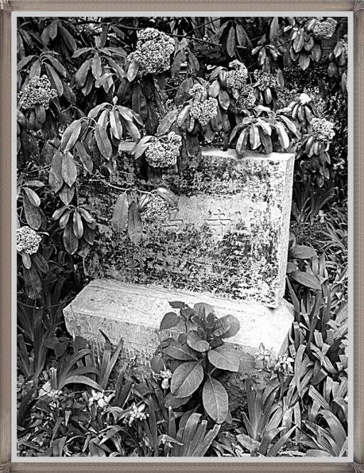
10 (a) This gravestone is surrounded by green vegetation.
.
10 (b) But if the intention is to illustrate morbidity, spookiness or the "colourlessness" of death then it should not be coloured. Believe it or not, this photo actually won me a prize.
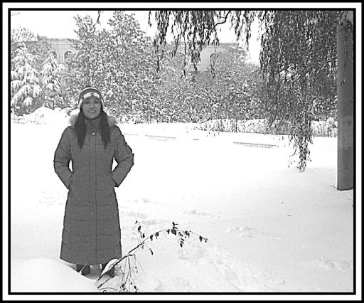
11 (a) To illustrate the coldness of winter, although the scene surrounding my wife is relatively muted, the colourful clothes she is wearing make it seem as if she is quite warm.

11 (b) But if the intent is to indicate coldness, then colour should be eliminated.
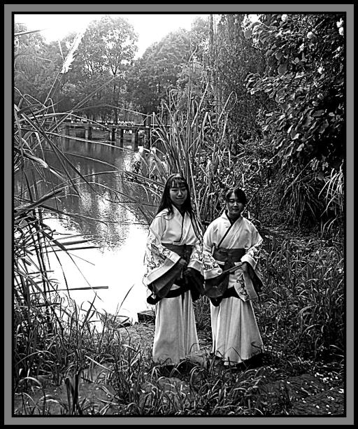
12 (a( There could be an intent to imitate a vintage or antique photo. Colour like this would most likely not have been available back in those days.
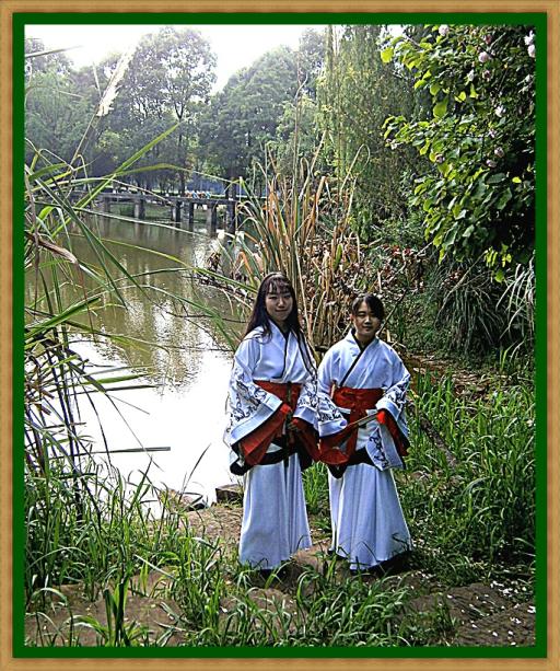
12 (b) Of course it is important that the subject matter be consistent with the era that one wishes to depict. It would be unreal for a vintage photo to show a car manufactured in 2018, or people using cell phones. To create a vintage or antique photos there are other applications for the purpose, for example sepia-toning, and with certain computer programs apply even more ways of ageing.
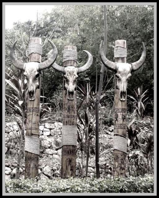
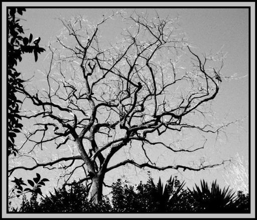
And I'll leave you with a prime example of why B&W is best if one wants to create a feeling of spookiness....
Tags