Modern Architectural Perspectives - Beauties and Beasts

Modern Architectural Perspectives - Beauties and Beasts
My previous article about architecture gained a lot of interest, so I'm hoping that some might spill over to this one comparing what modern architectue can appear attractive with what does not. What is good, bad or ugly is a matter of personal taste. I will propose my concepts and hope that you will do the same. My first examples are taken from the city in which I spent most of my life - Toronto, Ontario.
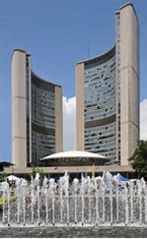
The Beauty - Toronto City Hall

I think that if any building in Toronto represents the city, and is a symbol of it that first comes to mind, it is the City Hall. The "flying saucer" council chamber is unique. I watched it being built because I was attending law school which was right next door at the same time. I should point out that it was completed more than half a century ago.
"In 1958, an international architectural competition was launched by Mayor Nathan Phillips in order to find a design for the new city hall. Designed by Finnish architect Viljo Revell whose winning proposal came first among submissions from 42 countries, It consists of near-twin towers surrounding a white disk-like council chamber, which is mounted on a raised platform with entrances located below...Revell died before the building was completed" (Wikipedia)
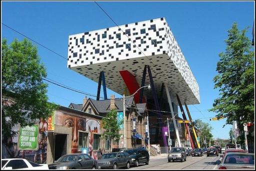
The Beast - OCAD (Ontario College of Art and Design) University

Can you believe that this design won awards? It's for an ART COLLEGE - oh well, "Chaqun a son gout.".
"The design, which came out of a process of participatory design. It consists of a box four storeys off the ground supported by a series of multi-coloured pillars at different angles and is often described as a tabletop." (Wikipedia)
The next examples are from Chongqing, the city-state in which I am now living.
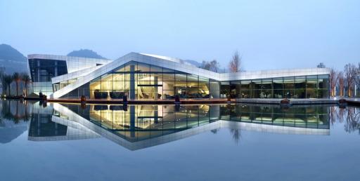
The Beauty - The Spark Architects Playful Clubhouse

I LIke the manner in which the Chinese architects blend the elements of nature with their buildings. For it to be beautiful, the building did not have to be a skyscraper or ultramodern.
The playful Clubhouse in Chongqing is the first part of a series of leisure facilities that Spark Architects designed for a large villa community in the outskirts of Chongqing, China. The clubhouse forms the center point...It functions as a mediating icon that brings residents, visitors, and all the elements of the master plan together. Spark Architects‘ design aims to embody the site’s steep topography, beautiful greenery and scenic views in the spatial experience of the architecture. The hotel, clubhouse and retail elements become part of a scenic route from a panoramic lookout fifty meters above the community down into the valley. Along this dramatic descent, the program has been carefully placed to respond to the topography and community needs. Thus, in the process of meandering through the landscape, one engages in activities that foster a healthy community and social interaction.
Surrounding the clubhouse is a shallow reflective lake abundant with [goldfish} and lotus. Wooden platforms outline the periphery of the building and bridge across the lake to connect the lobby with the residential villas.
The roof folds down towards the main entry forming outdoor seating, continuing the scenic route along the roof down towards the water. Thus the clubhouse seems to arise from the ground when approaching the main entry, and rising out of the reflecting water surface five meters lower on the opposite side of the building.
This terraced space is echoed in the interior spaces where the visitors enter into a low ceilinged space to descend into the double height space that is now used as the sales room. The materiality aims to blend the building into its natural setting by employing is a simple palette of textured granite and glass.
(written by Elliot Chang)
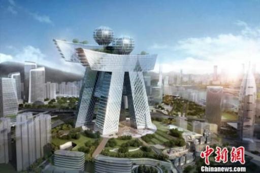
The Beast - Ren Ren Building, Nanan District, Chongqing

I'm glad I don't live in that area of Chongqing, although my brother-in-law does. I wonder how he feels about it. The Netizens of China, on seeing the design ridiculed it. I'm cheating here, because I don't know if this building has actually been built. Construction was suppose t have started years ago.
At Danzishi on the south bank of the Yangtze River in Nanan district of Chongqing city is a new design of building whose outer shape resembles the two [Chinese] characters of “人人” [“people people”]. This architectural design has a height of 280 meters, with the design of the building using the Chongqing city’s “人人重庆” [“Everyone Chongqing”] symbol/logo as reference, and is a multi-purpose building combining [hotel,] restaurants, entertainment, leisure, and other functions.
(by Fauna, ChinaSMACK)
NOW, can you post examples of modern beauties and beasts? Or at least comment on what I've posted?


For your eyes to feast, on beauties and beasts.
You really said it right Buzz, some are beautiful and some are really really ugly.
Austin TX city hall. Is it a beauty or a beast?
IMO, it's just kind of "meh". I don't like it. I don't especially dislike it.
To me, it's too busy. It has brick, stone, and wood, and that's too much... 2 out of 3 is good, but all 3 chops it up.
It exudes a feeling of strength and solidity, and has a bit of Frank Lloyd Wright appearance. So I thnk it's appropriate for what it's used for.
I agree with your assessment, Buzz. I like it.
I love the Spark architects clubhouse.
OCAD is an affront to good taste.
I spent my twenties soaked in architecture, since I had two long term boyfriends who were architects. I happen to like Louis Kahn's residential homes. They are also reminiscent of Frank Lloyd Wright.. he's kind of hard to ignore. Here is one of my faves.
A little boxy, but not bad. For me it is reminiscent of Habitat '67, the housing complex built for Montreal's 1967 Expo:
A more "close-up" view:
"Habitat 67 , or simply Habitat , is a model community and housing complex in Montreal, Quebec , Canada , designed by Israeli / Canadian architect Moshe Safdie . It was originally conceived as his master's thesis in architecture at McGill University and then built as a pavilion for Expo 67 , the World's Fair held from April to October 1967....Habitat 67 is widely considered an architectural landmark and one of the most recognizable and spectacular buildings in both Montreal and Canada. [1] [2] In 2017," (Wikipedia)
Homes built from shipping containers...They are fireproof, waterproof and nearly indestructible. You're starting to see more and more of these homes around the world and in the U.S.
We use to use them as office space for remote locations, then it became cheaper to use them as operations centers. They can be configured in any way shape or form that you desire.
I love that idea, Kavika. of the shipping containers. I just hope they have some place to shelter in during bad weather...
Here is an example of a Shipping Container home:
Clever space-saving interiors are possible in container homes:
Wow, Buzz, that neat character building with the balls on top is really neat! I love the one next to the reflecting pool, too!
I've been trying to think of modern buildings we have here in Louisville, to no avail. I'll have to do some looking, but maybe I can participate later...
I'll give you a litle help, Dowser. Here are examples of modern architecture in Lousville, Kentucky. You can choose a beauty and a beast from them.
Thank you, dear Buzz! I'm not out and about much any more, so forget what's new and exciting! In real life, the tower (has a white car parked in front of it), is the most beautiful to me! It's the Ruth Crisp steakhouse up on the top floor, and it looks like a lacy trifle, sitting in the sea of hospitals. Great food, too! But the building is special! I also like that pointed thing on the bottom right-- that's the River Bat stadium. We're a seed team for the St. Louis Cardinals, and they have games there all the time. The point is interesting, and, with proper safety gear, I've always wanted to slide down that roof...
The boxy ones, I don't know much about. They must not be on my regular route in the city... And, I guess they are my least favorite, although the one on the bottom is, at least, interesting!
This is the Owensboro Daviess County Hospital, which is a building of grace and beauty. The one fly in the ointment is that it is built downwind from the sewage treatment plant, so when you get out of your car, you nearly swoon from the stink.
Once inside, it is like having a hospital aboard the USS Enterprise... You walk around the curve, constantly...
My home town has just done a lot of work on our riverfront park, too! This is the local venue for concerts and plays-- we had our class reunion there... It's beautiful and gorgeous, and the river is right there, so that makes it even prettier! More traditional architecture, but still lovely!
This has been a great article, Buzz! Thanks for your help!