DISCUSSION 2 … Positive and Negative Space in Visual Imagery … Isolating the Subject

Design Principles: Compositional, Symmetrical And Asymmetrical Balance .
Balancing a composition involves arranging both positive elements and negative space in such a way that no one area of the design overpowers other areas. Everything works together and fits together in a seamless whole.
Positive space refers to the main focus of a picture , while negative space refers to the background . When used creatively and intelligently, positive and negative together can tell a story using visual composition alone. The term negative space is something of a misnomer.
Negative space , in art, is the space around and between the subject(s) of an image. Negative space may be most evident when the space around a subject, not the subject itself, forms an interesting or artistically relevant shape, and such space occasionally is used to artistic effect as the "real" subject of an image.
I am in the process of creating a series of images in which MOST OF THE IMAGE SPACE IS EITHER ENTIRELY BLANK/EMPTY -- WHITE, and/or comprised of a flat, featureless, single tone.
The key as to whether or not such an image "works" is in the presence or absence of balance … so, I want you to be the judge … image by image … either it works, doesn't work or "back to the drawing board."
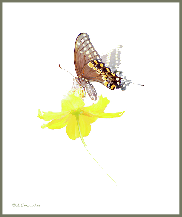
1) Swallowtail Butterfly, Cosmos Flower
© A. Mac/A.G.
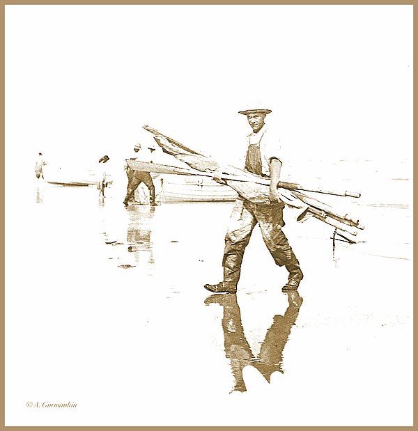
2) Commercial Fisherman Returning Home, New Jersey Coast c. 1900 (A Photo I Restored from a Magic Lantern Slide)
© A. Mac/A.G.
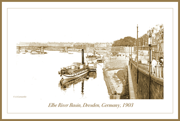
3) A Restored Photograph from a Magic Lantern Slide
© A. Mac/A.G.
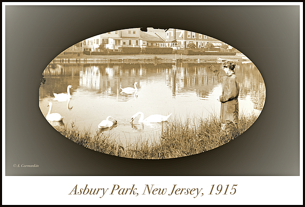
4) A Restored Photograph
© A.Mac/A.G.
I wasn't sure where this one was going once I got started; the dark (non-white) negative surrounding space created some compositional dilemmas; I finally decided on the oval and the vignetting at the corners and edges. And the sepia tone says "the picture is old," which, of course, it is.
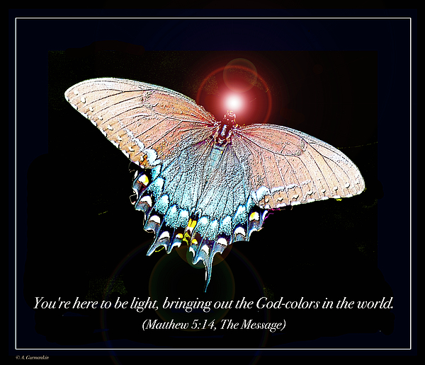
5) "God-colors in the world"
© A. Mac/A.G.


I may post some variations on the theme but without changing the concept … let's see how it goes … and please continue to critique as your comments are of value and importance to me.
I think besides "balance" the inclusion of something otther than the main subject adds much to the photo. In the butterfly photo, you added the flower, and in the second one there are objects being carried. As for the third photo, keeping the reflection still indicates that the boat is afloat and not flying through the air, but in the final photo, I think I would have lightened the colour of the matt to a sepia tone to match the tone of the photo, but dark enough to still show contast.
Actually, the flower is part of the original photo and not an "addition" … I would call the entity a "compound subject," the original background of which has bee digitally removed and replaced with a "featureless, negative space and or background."
I understand that keeping the reflection in the third photo constitutes a decision to retain a portion of the original, positive content, while simultaneously replacing other content with negative space.
As for mattes and borders, I sometimes struggle with color and tone choices … not wanting to overwhelm the content nor wanting it to blend into lightly-toned published formats like book pages.
The nice thing about "artistic license," is that it allows you to "drive around" until you find a good parking space so-to-speak.
There's a line in the film, "Pirates of the Caribbean" … one that asks one of the pirate characters … "What about the Pirate Code of Honor?" … to which a pirate responds … "Well, it ain't so much a 'code' … they's more like 'guidelines'!"
So let me hedge a bit and go with the idea that, it's not unusual to start with a concept or rule in making an image, only to subsequently find in the process, the concepts and rules often turn to be more like "guidelines."
Thanks for your input, Buzz … I love these kinds of discussions!
Really gettin' into it now!
It looks like it and and doing a really good job at it as well. Are you using Photo Shop to do these?
I've been playing around with a program called Paint.net. It's not the Paint that comes with Windows. I'd be interested in looking into Photoshop, if I were to really get into it. I would imagine it is much more versatile. I'm surprised Paint.net is as good as it is. You could do the same things you've done here with Paint.net, but it really takes a lot of time especially if you want to do a really good job like you have.
I don't know all the things I can do with the program I've been using either, although I'm learning I have been able to do things I didn't think I could do with it. It's fun, but I don't know a way to fade, like the top part of the butterfly was suggested. All the surprises I've ran into so far, it may do that as well.
Great butterfly/flower combo, would like to see the full color spectrum of the butterfly to balance the flower's saturation.
The fisherman is fabulous, only enhancement would be to "fade" to white his shadow.
Posted a 3) image; this one posed a bit of a different problem. Because the original sky and water areas were almost flat white, to make the content "float", it was necessary to extend the white "canvas" around the content.
Because the sale of this kind of print has been most vigorous with a caption as part of the print, I included such a caption.
I think it's pretty nice, but, you tell me.
You were posting it the same time I was commenting. Very nice!
I don't generally post BEFORE/AFTER regarding my restorations … I like to guard my process which evolves as I experiment. But when a friend asks, if I have one of the stages of the restoration (I don't save every stage), once-in-a-while, I will.
Here's the Dresden image after the initial scan of its Magic Lantern, glass slide original,
Explaining what I did without explaining HOW … • Adjusted the BRIGHTNESS and CONTRAST • Removed the GRAININESS and Dust and Spots • Fixed the FOCUS (a multi-step process that involves other fixes as well) • Converted the black and white to Sepia tone …
The original photo was a Magic Lantern Slide (glass sandwich); I know the year was 1903 since the slide had a notation as to where and when. Several years ago I acquired about 1000 of these slides … some have captions and numbers, some just caption, some just numbers and some … no information. It frustrates me to accept that there are many of the slides that I will never be able to identify.
You spent some time on that one and it shows. I put this here so I didn't have to scroll up to the top. Thanks for doing this AMac.
I'm going to try some negative space using black and/or darker tints and shades; obviously, the content must be able to stand out distinctly so it may take some trial and error.
Posted picture 4) … a different set of things to consider … but I'm happy with the outcome.
I find the process very interesting. It changes the whole feel of the photo. And although the original photo looks old, what you did with positive and negative spaces keeps the feel old yet brings a more artistic feeling to the photo.
I think you should be pleased with all of them..
I am really enjoying doing these ... Every one presents a new set of things to consider.
Thanks to everyone for coming here … more pix tomorrow.
Good night1
Image 5) … Note: I am not a religious individual … but I find much wisdom and much to ponder in the books of religion.