“If God created shadows it was to better emphasize the light.” ― Pope John XXIII

The unity of opposites …
• It is viewed sometimes as either a metaphysical concept, a philosophical concept or a scientific concept.
• It defines a situation in which the existence or identity of a thing (or situation) depends on the co-existence of at least two conditions which are opposite to each other, yet dependent on each other and presupposing each other, within a field of tension.
I continue to experiment with creating visual imagery that pushes the "familiar" … the "real" … to the "surreal"; in my current experimentation, I find that manipulating the effects of "light" to be crucial to achieving that end.
Aware that presupposition and expectation on the part of the viewer … apply to both reality and Art , I consequently display such images not knowing if they will be accepted on their own, on my own … terms … as they are, for what they are.
Be free with your critiques, criticisms … and, naturally, with praise (should there be any).
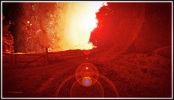
1) © A. Mac/A.G.
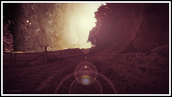
2) © A. Mac/A.G.
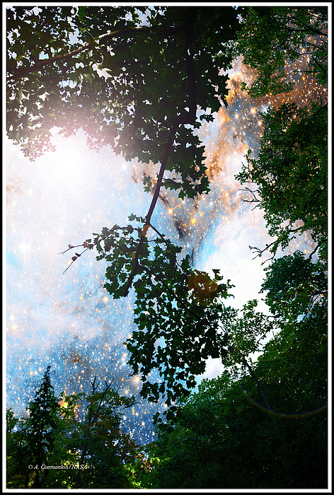
3) A. Mac/A.G.
Tags
Who is online
43 visitors
As the philosopher, Diderot said …
"Art should not be a copy of Reality …
One of the damned things is enough!"
Constable didn't follow that direction, and I prefer those who adhered to reality to a certain extent, such as Turner. I can't get my head into artists like Jackson Pollock. Most photographers in the historical series I've been posting were realists, but that's photography, reproduction, and their personal philosophies or the direction of their art or the purpose of it (such as historical record e.g. Atget and Abbott). Your having already displayed such skill at realism, your roots in painting and desire for exploration have directed you to experiment further towards an extreme following Diderot's direction, but taking it too far exceeds something that you were accomplishing with SOME experimentation such as in your layering starry skies. Venturing too far might alienate most and be attractive to only some. However, don't let that stop you from going to extremes. Remember Robert Browning's poem wherein he stated: "Ah, but a man's reach should exceed his grasp, or what's a heaven for?"
Thanks, Buzz.
There are three "genres" I work in related to photography …
• For PUBLISHERS, almost all of whom want literal images, that is, without editing beyond contrast, and then, without extremes beyond the reality that was photographed
• For DIRECT PUBLIC marketing … anywhere from literal to surreal
• For myself (as some art historians believe Turner did with some of his paintings …) without regard to convention, commercialism, critics …
I trash most of my "experiments" … and … many of the ones I don't trash … I cannot repeat in terms of all of the edits … mostly, I just start with an idea, and, when it does not proceed as I envisioned (which is most of the time), I continue until I like what I've done … or … give it up and trash it.
Come to the light … away from those on The Dark Side.
Each of them have a uniqueness. I like 2 better than 1. 1 has an appeal to make it look like there is a danger in the area. The color represents a chaos, everything is seen and visible. It feels like there is an immense heat, or explosion.. None of this is a bad thing, to me it is how the tone is set.
2nd picture is a complete opposite of the first. It feels more calm, peaceful, a serenity of some kind of guiding light. Also there are more darker areas which allows the mind to be creative in my own person imagination of what is there in the darkness. Even a predominately dark picture can set off the mind on exploration to find the slightest hint of a lighter color. We try to make out outlines of something, then our minds create the rest..
3rd Picture. To me, shows a 3 layer depth.. I can make out a darkness way in the back ground, in front of that is a mist with light, and then in front of that are the leaves and trees. There is really another depth with those trees because it shows their shadow and their highlights. At the same time a darkness in the lower right corner which makes me wonder what is there, what can I see, what can I make out and perceive. I also think the picture seems like it ties 2 worlds together. A chaos in the background, and a peacefulness in the front. So even the over all tone of the picture has a depth other than just the colors..
Good work. I like them.
Thank you Michael; an outstanding analysis and quite valuable to me as I evaluate my own work and consider what's next. It's often near-impossible for me to be objective about my own pictures, so, all critical, outside commentary is worth a lot.
Again, I thank you.
The red is rather startling, but I could get used to it. I do like the spheres rising up to show the way to the light.
Thanks for the feedback, Steve. I might try the same scene with color and saturation variations.
I like 1 better than 2
I'll try some others, Steve.
I am a certified Bob Ross Instructor and one of the things as an artist is the ability to use light against dark and dark against light.
That is why my favorite type of paintings to paint are ones that start with a black canvas.. Any lighter color jumps out on it.
Thanks Michael.
Just posted a toned-down variation that still exploits chiaroscuro.
Posted 3) … different altogether from 1) and 2)
Now, THAT'S what I prefer to see.
Now that one is both earthy and otherworldly. I very much like it. Great work.
I like 1 better than 2, but I truly like 3. I do enjoy bright lights and vibrant colors.
Thanks for honest feedback … I have many more in the manner of image 3) … so … I will be posting them soon.
I liked 1 because it was just a explosion of light and I like the color and the walls. The second used the light as a focus as your eye tries to pick details in the light/shadows in the walls leading to the light. The third is just beautiful.
I can't come up with one possible suggestion of any changes on this set, too good to mess with.