A quartet of MAPS


I've loved maps for seventy years.
The amount of information that can be transmitted is fabulous.

A better way to visualize US Election Results
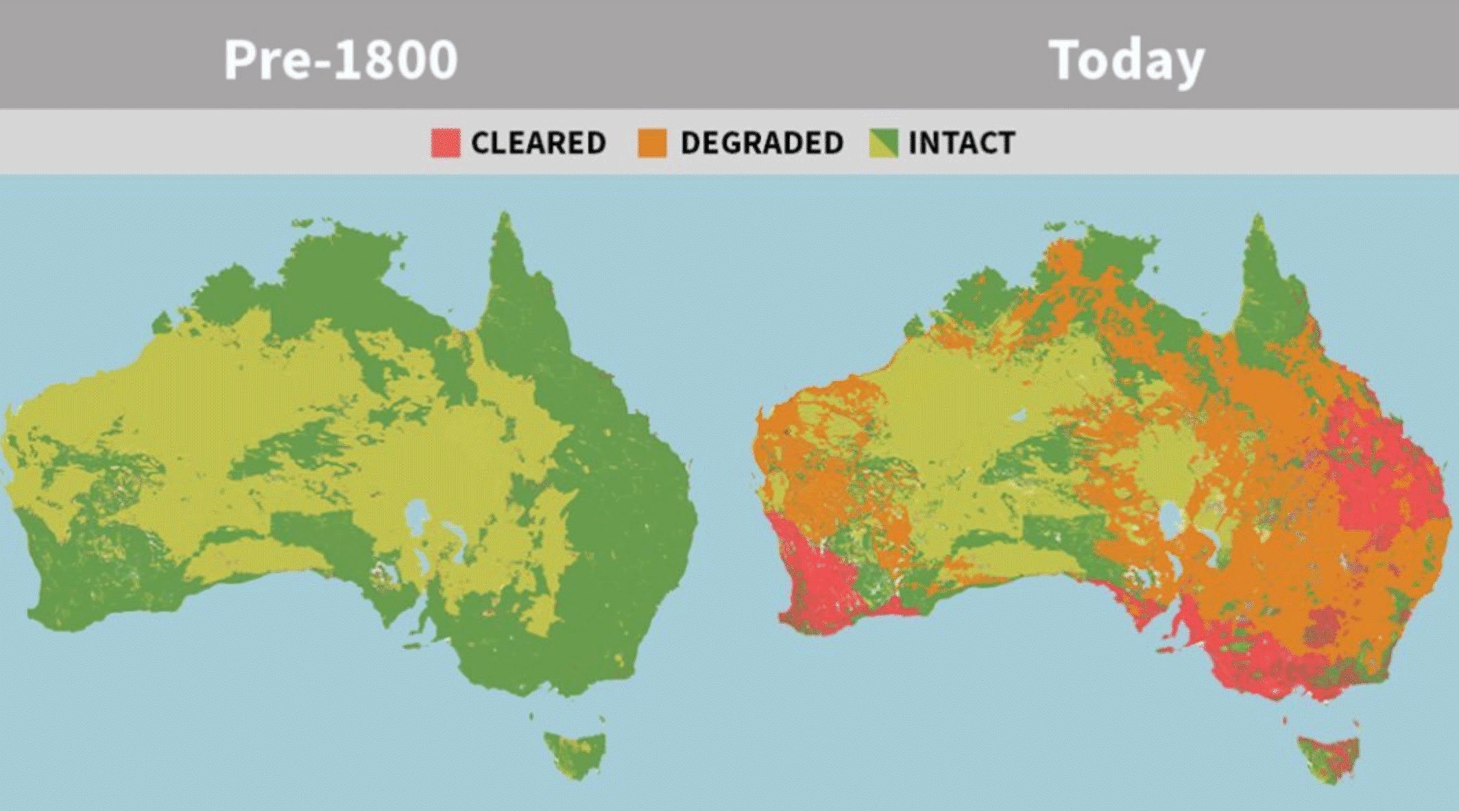
Deforestation in Australia
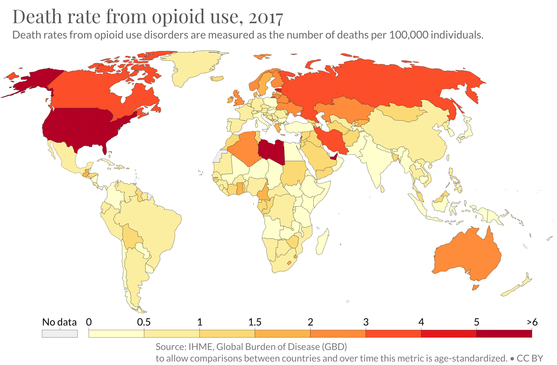
Death rate from opioid use, 2017
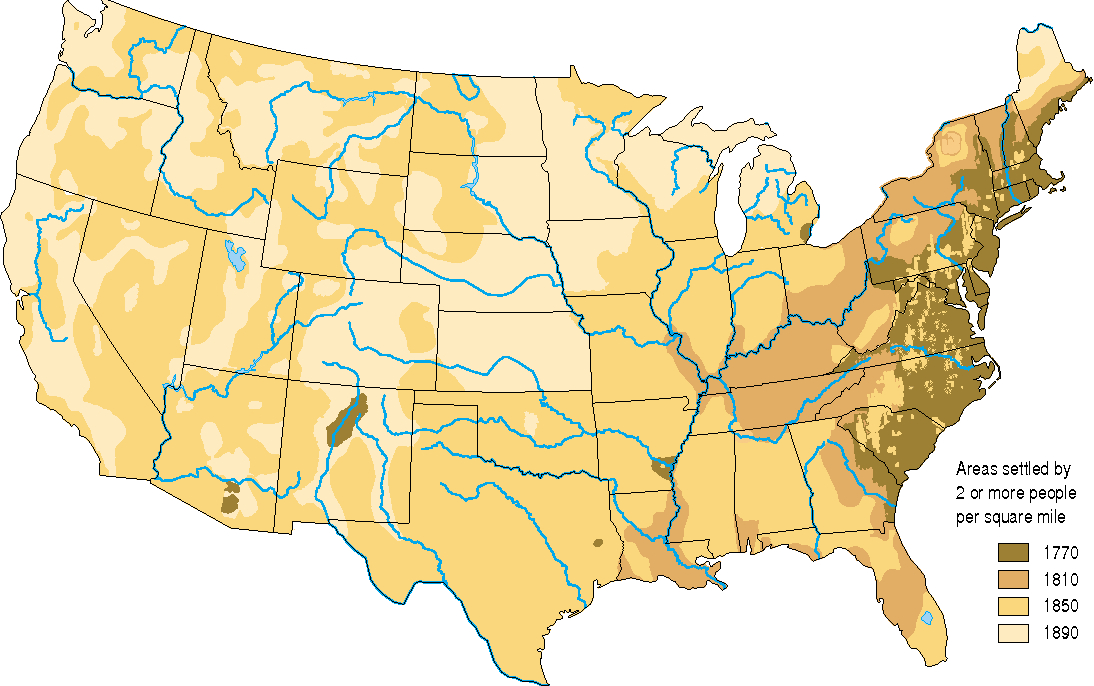
[European] settlement of the US 1770 - 1890
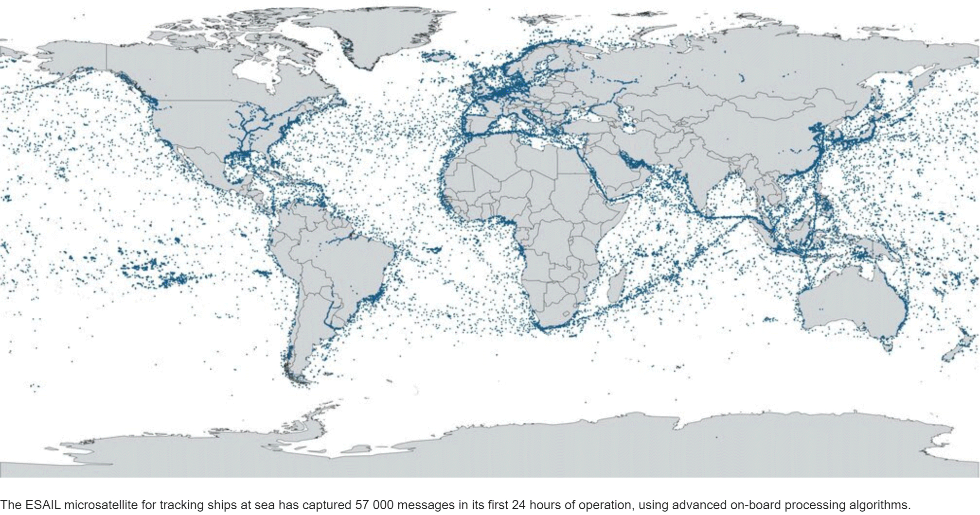
ESAIL’s first map of global shipping
A better way to visualize US Election Results

Death rate from opioid use, 2017
The progress of [European] settlement of the contiguous United States from 1770 to 1890
ESAIL’s first map of global shipping
Tags
Who is online
85 visitors
There is indeed a lot of information in the first map, and it's it's much more precise than the usual "all red/all blue" but it would take some getting used to.
Human impact on Australia's ecosystem is... ... remarkable...
When will we recognize that The War on Drugs has been a disastrous defeat,
Perhaps most important in the fourth map... I had to add the word "European" to the title. The map takes no account of anyone who may have been present before "settlement"...
The fifth map was generated in 24 hours! "The ESAIL microsatellite for tracking ships at sea has captured 57 000 messages in its first 24 hours of operation, using advanced on-board processing algorithms."
I love the maps.
The US is number one again. Opioid deaths, pretty damn sad.