
The staggering weakness of the US recovery from the last recession in one graph


http://cepr.net/data-bytes/gdp-bytes/gdp-2016-04
The weak growth for the quarter puts this recovery even further behind any prior recovery at the same stage. After eight and a quarter years, the economy is only 10.1 percent larger than its pre-recession level of output. A more typical recovery would have seen at least twice as much growth. 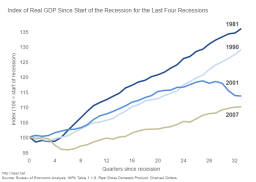
Tags
Who is online

94 visitors
Historically, the sharper the recession, the better the rebound. Under Obama, the rebound has been nothing short of disastrous.
He's going to be the first President to leave office without ever having a single year with over 3% GDP growth.
I'm sure that the graphs are correct Sean, but lets face facts. Our economy is no longer based upon manufacturing, but service sector jobs. During all previous recessions, we had manufacturing capacity to turn on. Today, with outsourcing (5.8 million manufacturing jobs lost between 2000 and 2008 to overseas to be exact) the number of good paying jobs just aren't there any more, and will never again be. This is the new norm. As such, the graphs are comparing apples and oranges.