The Internet Is Having Way Too Much Fun With Hillary Clinton’s Campaign Font



Thanks to some hard-working graphic designers, a crowd funding campaign, social media, and the internets collective mantra of If its worth doing, its worth overdoing, you can now write your own messages using a font based on the H in Hillary Clintons campaign logo.
Hillary Clintons rather unorthodox campaign logo has been the subject of amusement, criticism, and downright mockery since almost the very moment it was unveiled last Sunday, according to Washington Post.


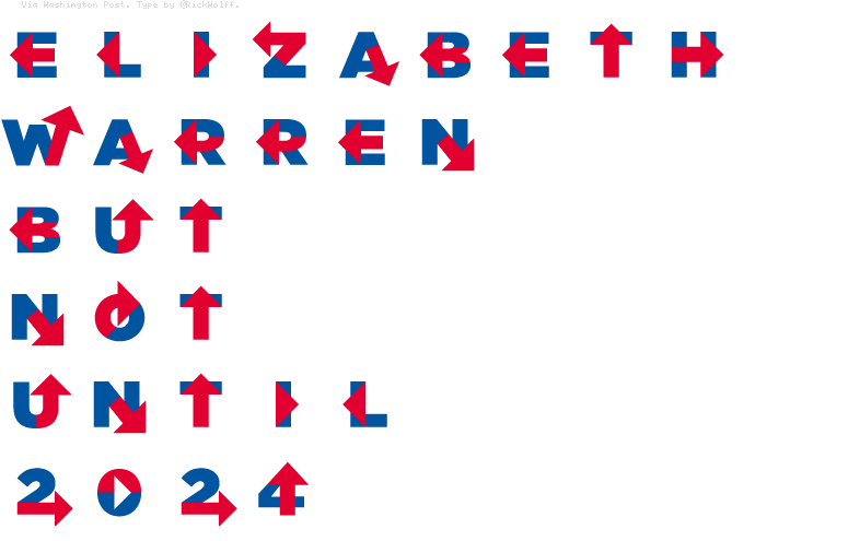
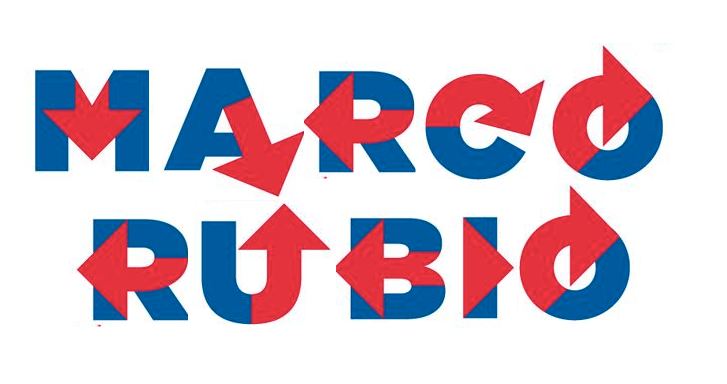
Although Wolff at first called the new font Hillary Bold, the internet has decided that Hillvetica works better. And social media users have taken the new Hillary font and run with it, according to Independent Journal Review . Using the Twitter hashtag #Hillvetica, users have come up with some rather clever uses of the Hillary font.
One presumably conservative Twitter user used the Hillary Font to point out an issue that is likely to dog the candidate throughout the upcoming campaign.



Posted without malice afore thought purely for the fun of it!
Good one RIO, my morning laugh.
Great post! What fun!
It just goes to show that anything no matter how meaningless can be made important on the internet by someone
Glad you liked it
Appreciate the feedback and glad you liked it
I laughed like crazy when I saw and thought others might enjoy the article as well, glad you did
Thanks for the feedback
Good find RIO....
Somewhere along the line we all should have a "best sign" competition.
Looks like a hospital sign to me. Fitting as the country will probably need life support when she is done with it.
Oh my morning laugh, now not only is the arrow pointing right, it's pointing all over the place...
Good one Robert.
FLY
Best sign, most confusing sign, funniest sign, each could make a good article
Thanks for the feedback
96
Come on no political cpmmentary, the article is for fun and enjoyment only!
N M
You are welcome glad you enjoyed it
Nona
Thanks