"Creative" Overtakes "Literal"

Most of the photos I shoot are for book publishers, advertisers and other markets that require "literal" imagery, that is, the way their subject matter appears in reality.
But I sometimes need to get away from the literal and get creative …
I rarely go all the way to abstraction and pure expressionism, but sometimes, pushing realistic images just a little … creates something fresh.
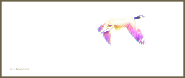
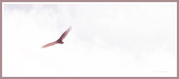
Today, I started a "fresh," creative series … first examples below.

© A. Mac/A.G.

© A. Mac/A.G.


Even a tight-ass like myself lets go once-in-a-while.
I'm waiting for you to become creative with photos of the Close Pin Tailed Biff Sniffer or the Gillygaloo Bird.
Those two should make good use of your creative streak.
Very cool photos Mac, I like them.
Please let us know what you have done to your photos that change them from what would have been a normal or average untouched photo. I think that the positioning of the subject is one aspect, another is the complimentary framing, but perhaps most important is the colour variation and the dream-like mistiness.
Buzz,
Mostly, I slurred the details (slurred more than blurred … but somewhat blurred), heightened and or modified the saturation of colors and slightly … very slightly over-exposed parts of the backgrounds until the became white and featureless.
Positioning has a lot to do with "balance" in composition; both birds are place roughly where horizontal and vertical thirds intersect but occupy a smaller space than the space that surrounds them. While such placement and negative space could throw the balance into imbalance, I believe that in these two images, that aspect puts "air" under and around them to enhance the feeling of flight, hovering, soaring …
… I believe that you can only "talk" an image to a point, after which, words are no substitute for what a viewer might "feel" from the visual.
Don't know if I answered your question adequately.
Perfectly. I'm grateful for the lesson - even at 4 score we are not too old to learn. That makes me think of what I believe was a German adage (Dowser might know) that "We grow old too soon, and smart too late."
Haven't looked up the book's exact title or book cover, but the second I saw the second picture, I thought, "Johnathan Livingston Seagull".
Got out this afternoon and have some really interesting new pictures to share.
Good night for now.