Keeping My Balance & … Considering How Much is "Too Much" and How Much is "Just Enough"

Design Principles: Compositional, Symmetrical And Asymmetrical Balance .
Balancing a composition involves arranging both positive elements and negative space in such a way that no one area of the design overpowers other areas. Everything works together and fits together in a seamless whole.
Positive space refers to the main focus of a picture , while negative space refers to the background . When used creatively and intelligently, positive and negative together can tell a story using visual composition alone. The term negative space is something of a misnomer.
Negative space , in art, is the space around and between the subject(s) of an image. Negative space may be most evident when the space around a subject, not the subject itself, forms an interesting or artistically relevant shape, and such space occasionally is used to artistic effect as the "real" subject of an image.
I am in the process of creating a series of images in which MOST OF THE IMAGE SPACE IS EITHER ENTIRELY BLANK/EMPTY -- WHITE, and/or comprised of a flat, featureless, single tone.
The key as to whether or not such an image "works" is in the presence or absence of balance … so, I want you to be the judge … image by image … either it works, doesn't work or "back to the drawing board."
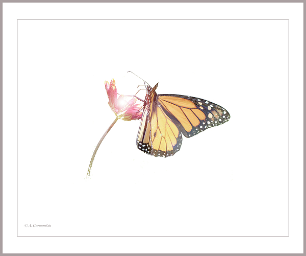
1) Monarch Butterfly on Indian Blanket Flower
© A. Mac/A.G
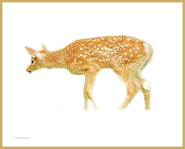
2) White-tailed Deer Fawn
© A. Mac/A.G
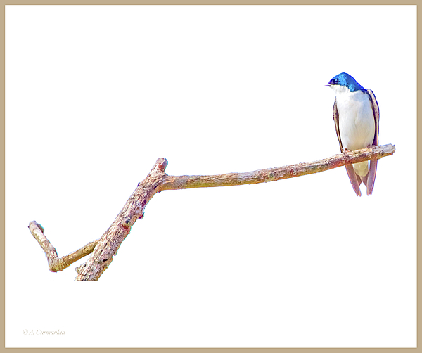
3) Tree Swallow on Branch
© A. Mac/A.G.
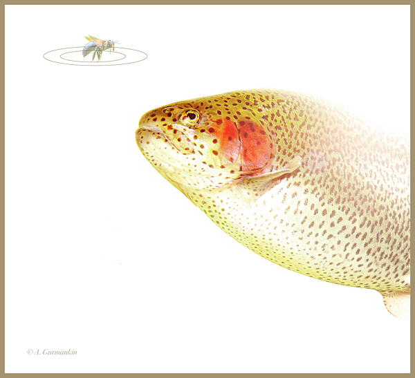
4) "To Bee or Not to Bee?" An Artificial or the Real Deal?
© A. Mac/A.G.
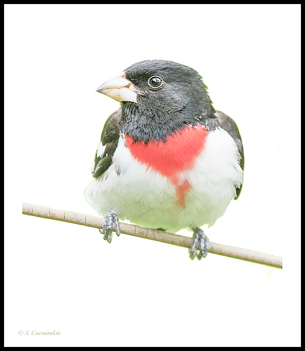
5) Rose-breasted Grosbeak
© A. Mac/A.G.
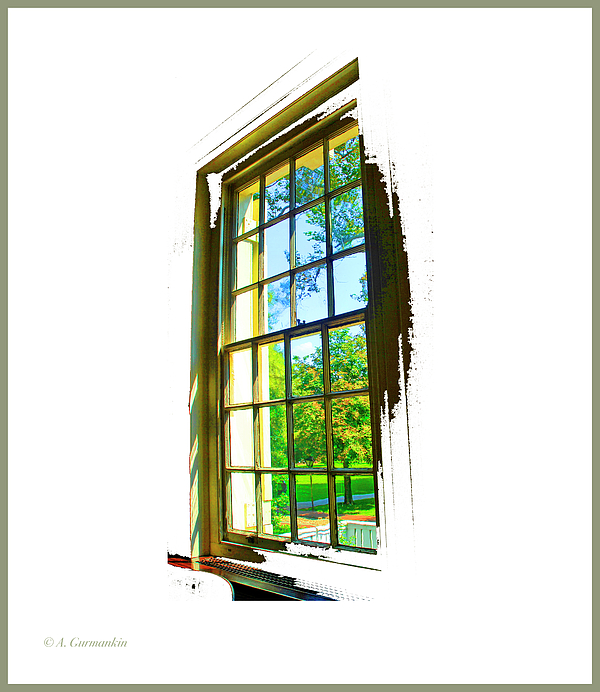
6) Colonial Window
© A. Mac/A.G.


Please … don't be shy or diplomatic … I sincerely want to know if an image "works" for you or not.
I feel that in all of your examples your concept works extremely well, save for the deer, that I feel fills too much of the frame.
To me, Backgrounds take away from the true focus. I like the simple myself.
If the Butterfly filled most of the frame, would that be your preference?
Regardless, your input is appreciated (and happy to see you here).
Nope. I like it just the way it is with all the white. If you had filled the background with fields, tree's, mountains, other flowers etc...., to me, it would have taken away from a beautiful subject. The Butterfly is just big enough.
Thank you for the clarification … I'm about to post image 2).
Image 3) now posted.
I'm a colors guy, I love to see the colors of nature in the background. White seems to isolate the subject. Out of the 3, number 3 is my favorite.
Picture 4) "To Bee or not to Bee" contemplates the Trout
Where is everyone? I hope I haven't put too much negative space between us.
LOL
Now there are 5).
sometimes just the main image without anything else is great
I like your new avatar!
Disney World Magic Bands came in today's mail!
Yay!
And on that happy note, a good night to all.
I like this style Mac. No clutter and the subject is defined by the lack of background.
These are fantastic. We see background everywhere we look. It’s a treat to get to see subjects with the background removed.
I'll be experimenting with black and other solid-color negative space next. Theoretically, it should "work," but, where WHITE seems not to distract, but rather, accentuate subject, we'll see what flat, featureless colors do.
I'll do others with the white, maybe try the same subjects on black, and some, totally different.
Number 6) … everyone will see through this one.
My favorites are 1st, 3rd and the 6th one. The deer is my least favorite one because she has no shoes.
I have some deer shoes for her.
Whoops, almost forgot.
Thanks, Six; I took a lacing on the deer pic ... I should have let the grass around the hooves instead of cropping it out. I will re-do it.
I figured her feet were blocked by the grass. I really think having the grass in there would be very nice. Not a lot of grass in my opinion.
In some people's opinion, you can never have enough grass! G'morning Picky, donut?
Agreed; poor decision on my part to crop out the grass; I will try variations with that fawn and or others.
Some ideas simply do go up in smoke; as do certain joint ventures.
1. Stunning in both subject and scale
2. Eye immediately focused on the lack of hooves thereby detracting from the detail of the fawn.
3. Like the first one, it's stunning. The branch, with it's multiple segments, brings the random beauty of the perch by adding texture to subject.
4. Least favorite, not having an entire fish with the ability to include white space behind the subject.
5. Beautiful, the only detractor for me is the perch.
6. Still pondering this one! First glance, didn't appeal as I found the frame distracting. Lingering on the photo becomes more appealing as I take in the depth and detail. Like many fine art pieces, lingering is required to take in all it represents.
Personally, your work brings joy to my very being. A respite I respect and admire.
The critiques are extraordinarily helpful and truly appreciated. It is often difficult to be objective about one's own work so unbiased eyes are of great value.
I will be reworking the fawn and the trout images ... staying with the concepts but hopefully improving the presentation.
If nothing else Mac, you know me to be honest!
I will definitely be doing more butterfly pix with different colored negative spaces.
Love them all.
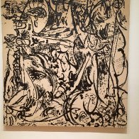
I have this hanging in my office:
Sorry for how it looks, but I haven't figured out how to put MY pictures up and make them look good, and I got a lot of flashback from the flash when I took the picture.
At the bottom row of the toolbar, at the extreme right, just before the emoticon symbol, is a small arrow for "Embed Local Media."
Click on that and it will take you to your computer where you can select the image you want to upload … choose/select the one you want, then choose "original" and that should do it.
aaaaaahhhhhh.....I didn't do that part. I'll give it a shot.
Okay, What did I do wrong.
Now my words are cut off.
Once the image is posted, place the text cursor underneath the image, give it one tap on the return and then type in your text, use the alignment choices at the top of the edit bar to choose if the text is centered or justified right or left.
Got it. I had written the words first, then popped in the art.
Forgot to do the "Space Thingy" AFTER the words, before I attached.
Anywhooo, You can probably see that I like simple. We have a few pieces in our home like this. NOTHING complicated.
Hi It is me.....there is a an article I posted 4 months ago for Members that might help in resizing your images. Mac has given the instructions on how to insert them, and this link will take you to the article on how to resize them before posting them.
I hope this will be of some help. (smile)
THANKS, THANKS, THANKS !
I'll have to experiment on the size choice. I had picked the first "Medium" that came up.
I was WRONG, Wrong, Wrong on that choice.
You are more than welcome, I am glad that it will be of help. I find that the size 350 is a good size and fits int he window well, however, some like a larger size for effect. Although, sometimes a much larger size will distort the clarity of the image. So that is why I posted the article on how to resize the image larger or smaller for better clarity and sizing to help. (smile)
Thumbs Up !