Guide to the Tracker
What is a Tracker?
A tracker is a mechanism built within a discussion forum that tracks comment activity and presents a custom record of this tracking for each user. The tracker is based on the idea that each user wants to follow activity on one or more articles (a discussion or a blog).
With a tracker, a user can quickly identify the new comments across all articles the user is following.
Following Articles
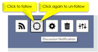
To track, a user must first register interest in an article (a discussion or a blog). This is called ‘ following’ the article. For discussions (not blogs) one can explicitly register interest by clicking the Discussion Notification button in the upper right corner of a discussion. This tells the system that you are interested in being notified of comment activity in this discussion. This button is a toggle, so if you click again, you will un-follow.
Another way to follow an article is to enter a comment. The system will automatically recognize you as following the article.
Once you are following an article (either implicitly or explicitly) every new comment made on the article by other users will be tracked for you.
Tracker Page
The new menu item (to the right of home) is labeled Trackers . If you go to the tracker page you will find two columns: Current and History . The Current column holds the actively tracked comments. This is what we commonly label ‘the tracker’. The History column also is doing a form of tracking, but in this case it is tracking the history of discussions and comments.
The tracker (Current column) makes it easy to jump back into articles and pick up where you left off without missing any of the activity. The lists in the History column are good for finding items you have already visited.
Our focus for the balance of this document is on the tracker-proper – the Current column.
Tracking Comments in Articles
The tracker column looks like this:
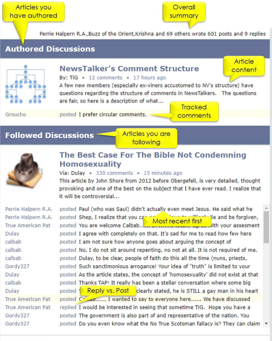
The tracker organizes recent comments by article with the most recent comments appearing first. Further, it organizes the articles into two categories: Authored Discussions and Followed Discussions .
Authored articles (discussions or blogs) are those you either authored or seeded into NT. In both cases, you are considered the NT author. Followed articles are those you did not author but are tracking (following).
Each article profiles information for you to recognize the subject matter. The comments you are tracking are listed below the article profile. You can click on the article to go directly to its content (if you wish to re-read). You can also click on a listed comment to navigate directly to that comment in the article.
The tracker will provide the tracked comments for an article in a scrollable list. Each tracked comment shows the comment author, action (‘ posted ’ or ‘ replied ’) and a sense of the content. The term ‘replied’ is used when the comment is directly replying to a comment you made.

Cease and Discard
Each article in the tracker provides two buttons: Cease and Discard . These buttons manage your personal tracking for the article. Clicking Cease will remove all comment tracks for the article and un-follow the article. When you have lost interest in an article, click Cease . (You can always follow the article again if you later change your mind – just go back and enter a comment.)
Discard , in contrast, simply forgets your current tracked comments. You are still following the article, so any new activity on the article will be tracked.
Tracked comments are controlled by the user. They will stay on your tracker until you discard them, cease tracking or explicitly un-follow the article. You can explore one article (even in part), return to the tracker and explore comments in another article and then return to the first article. Your tracked comments will stick around until you are done with them.
Using the Tracker
The value of a populated tracker is that it serves as the master index into comments you are most likely interested in reading. When you click on a tracked comment, the system will bring up the article and position you directly to the comment. It will also automatically bring in the Navigator tool.
Navigator
A tracked article looks the same as any other article except for a few features. First, every tracked comment will highlight the avatar of its author. In result, you could manually scroll down the comment list looking for highlighted comments.
Another option is to use the Navigator. The Navigator is controlled by the Navigator button (on the right). This button has two parts. The top part navigates up (previous) and the bottom part navigates down (next). If you press the control key ( CTRL ) while clicking the Navigator, it will navigate to the first (top part) or last (bottom part) tracked comment. If you have scrolled and simply want to return to the current tracked comment, press the SHIFT key while clicking the Navigator.
There will always be a current comment. The current comment is the last one the navigator took you to. (By default, this is the first tracked comment in the article.) This means that you can scroll up and down the list of comments without losing your place. The Navigator will always remember the current tracked comment.
When you click on the Navigator to navigate to a comment, the target comment will be highlighted in its entirety.
The Navigator will stop when it runs out of comments. When this happens, the Navigator will show gray for the direction that is exhausted. This is simply a visual clue that there are no more tracked comments to be found.
Summary
The tracker consists of three parts: Following , Tracking and Navigation . One follows an article by explicitly clicking the Discussion Notify button on a discussion or by simply entering a comment. Tracked comments will be marshaled by the system and presented to you in the Current column under the Trackers menu item. This is where you manage tracked comments ( cease and discard ) and how you go to the comments (and articles) of interest.
Once in a tracked article, the Navigator will provide highlights and custom navigation to help you focus on the tracked comments.
Appendix: How to Start Using the Tracker
If you would like to cut to the chase and just see the basics in action, then do this:
- Go to an article of interest (a discussion, group discussion or blog).
- Enter a comment. (You are now officially tracking the article.)
- B E P A T I E N T Nothing will happen until someone else enters a new comment on your article of interest.
- When someone enters a comment you will see it (and the article) on your Tracker page.
(Menu item 'Trackers'). - Note that none of your comments are ever tracked; only comments by others.
(You can see your own comments in History.) - Find a desired tracked comment and click on it.
- You will be taken to that comment in the article.
- Each new comment in the article will have a highlight around its avatar to show it is new.

Questions regarding the Tracker are very appropriate here.
Great article, TiG, very well stated and should be easily understood.
Thank you, head Beta tester.
Very good article. I will have to review it again earlier in the evening. Raven is much smarter than I am and it takes me a few times to get it. Just kidding Raven.
I wish! (grin)
I'm really liking it so far, TiG. I have one teensy suggestion, though.
It has to do with this feature:
Wouldn't it be a good thing to make the words 'posted' and 'replied' different colors? Or perhaps have the background under each listing be a different color for posted and replied? Or maybe just some kind of extra character next to replied, like a star or something?
It might be easy to miss a reply on a very long discussion track the way it is now. Both words are 7 characters long, both are the same light blue color, and both end in 'ed'. As one scrolls down a long list of tracks, the two words tend to blur together. I'm thinking if there was more of a difference between the two, then people would be much less likely to miss a direct reply to one of their comments.
Just a suggestion. Anyone else have any thoughts about it?
Oops. Posted is six. Duh. Sorry about that.
The point is they are close enough in length to look nearly the same on the list as you're scrolling through.
Maybe a bit larger font.
I'm having a great experience with it so far - easy to follow, and very user-friendly once you're used to it.
Makes sense.
To be practical, we will let this blog run for a while and accumulate (and then consolidate) suggestions before we act. Of course bugs will be the exception - they will get top priority.
One point: Without getting into the technical details on how the tracker display is calibrated, we would likely go with a different color font rather than a style change that would change the size of the display.
A color difference probably would be the best. The site's theme is already various shades of blue, so leaving 'posted' the way it is, a light blue, and making 'replied' a darker blue for contrast would be in keeping with that theme.
I don't know about everyone else, but that would certainly work for me.
I agree. The darker blue for one or the other might work well, and only means that TiG would have to make the exiting color darker as opposed to a new color. And that should provide for a good contrast between the two.
Just my thoughts on it.
A tracker upgrade went in today and it included a style change for replies.
The color blue is used for hyperlinks. Since we are trying to propagate more standardization in NT, blue would not be a good choice. Shades of a standard color are not how websites are designed nowadays so a shade of blue or purple was not ideal either. The color red, however, is already part of the NT standard. Red is used when bringing something to the attention of users. Typically an error message, but not exclusively. (If a LOCKED article ever appears on your tracker you will note that the word 'LOCKED' is in the same red color.)
So we went with red. It seems to contrast nicely with the purple (NT base color) of the posted text.
Thoughts?
Good contrast and well done!
Thanks for providing a REPLY so I could see the color in production.
You're very welcome. Gotta keep the testing going to make sure all is working properly. (big grin)
Wow. The red makes a big difference. It really stands out. I think it's an even better contrast than a darker blue would have been.
It looks and works great, TiG. Thanks.
By the way, how hard would it be to make the 'discard tracks' and 'cease tracking' options not cause an automatic page refresh, so that multiple discards or stops could be made in one viewing, without a whole page refresh between each action?
TiG, I just tested your fix out on a few different articles and it works great.
Smoke and mirrors.
First of all, I would like to say thank you to TiG for working relentlessly on this tracker. Most of our members don't understand the hundreds of hours of work that TiG put into the tracker to make this happen. It is a wonderful addition to the add site and we would never have had it, if it wasn't for TiG's hard work.
I would also like to thank the beta testers. They really did a fine job of making sure it was working, and finding the little modifications that were needed.
I hope that the tracker increases the membership's enjoyment of the site.
Thanks again TiG. You are da Bomb!
( It was not that much work. But there were indeed some tricky parts due to the idiosyncrasies of technology. ) :)
Seems to me we have a well moderated discussion site here at Newstalkers so if it is possible to improve the experience with known valuable functionality such as a tracker then I am quite willing to lend a hand to do so.
It has been a personal pleasure to turn off email Notifications and just use the tracker.
Well, it's been much appreciated.
Indeed! TiG and I worked with the Beta Team and was very helpful, tirelessly explaining in detail the functionality of the Tracker and the Navigator, and guiding us through the steps of how everything worked. The function was a first for me and I truly enjoyed the challenge and working through all my questions with TiG.
He da Man!!
Question: How do I get to the ‘Forums’ page? The Tracker seems to now occupy the slot where Forums was - on the mobile version anyways. I want to post a seed, and I’ve got no way to do it in a forum.
This is just responsive design in action. On a smaller device (such as an iPhone) you will see the Current column (and its content) and then as you scroll you will see the History column (and its content). The History column is the content of the old 'Forums'.
Ok - I get it now. Thanks.
Tried going to an article and clicked the "follow" button but the article is not showing up in the "followed discussion" column on the tracker page ?
(I'm so confused)
It will only show up if a comment has been made on that article after you clicked the Follow button.
Others had to get used to this too Pat so don't be concerned.
Just be patient.
The Tracker gives us the ability to say 'I want to be informed if anyone posts a new comment on this article'. We can say this several ways, but the easiest is to just enter a comment on an article (but clicking follow as you did works too). Do that and the tracker starts watching for new posts (after yours) on that article.
As soon as someone posts a new comment (after yours) your Tracker (the Current column on the Trackers menu item) will show it.
I was a bit confused by that as well at first during the Beta testing, Pat. I thought that after I clicked on the Follow button on the article that would trigger the discussion to show up on the Tracker list. But, as TiG and Sandy said, it won't show up on the Tracker list until a new comment is made. So unless someone makes a comment after you are following, then it will show up.
I myself had never used the Tracker on NV so it was a new function for me, and it took a little while to get used to the concept of how it worked. I myself really like the Navigator, but, that too took a bit to get used to.
If you find anything else that is confusing or does not seem to work as it should, please let us know as we are here to help Members get used to the new function and see how well it work for Members. (smile)
When I look at the tracker for articles I've participated in I notice numerous times that it states "You liked this" when in fact I didn't "like" the comment, don't know how that is happening.
Pat, I just checked both in the Tracker and on the Tracker in my home page area, where the Tracker also shows up under the My Discussions tab, and I am not seeing anything like what you describe. I looked very carefully and did not see any "You liked this" listed anywhere on any of the tracked comments. I think this might be something TiG could check on his end.
Perhaps if you could take a screen shot and post it for him it might give him a better idea of what you are seeing on your end and where they are showing up.
The only time I see 'You Liked This' is on the popup when I hover over the thumbs up button on a comment that I have liked.
The Tracker has nothing to do with comment Like functionality so offhand there is no advice I can offer. At this point all I can do is be on alert for this behavior.
Here's what I'm seeing :
Do you normally not see graphics? That screen shot looks like nothing I have ever seen on NT.
What browser are you using? What operating system is on your computer? If you know of any other factors of your environment that are unique please let me know.
Pat....that is really odd, I have never seen that anywhere in the Tracker, and I was on the Beta Team from the beginning. I am not saying you aren't seeing it as obviously you are. However, I can't find anything that matches what you are seeing in either place I can see the Tracker.
Where exactly are you seeing this? On the article page, or in the Tracker list itself? I am asking as I am trying to mentally find out where this is coming from.
OK....Pat, I think I know what you are seeing now, I can see the same thing in XX's article at the top of his article on getting his full posting rights restored. That has to do with what happened by the way he moved his article from the Politics to the Metafied Group at Perrie's request. It does not have anything to do with a malfunction of the Tracker. However, TiG can perhaps clarify if that is the case.
I'm sorry that I did not catch on faster, but, I just visited the article and saw it and checked it out. I hope this helps clear the mystery a little. At least we now know where it is coming from.
Good find Raven. Yeah that is some strange stuff. Looks like HTML that has been copied and stripped of the HTML instructions.
Anyway, you are correct, if this is the problem then this has nothing to do with the Tracker (or with NewsTalkers in general for that matter). This is just article content formatted in a strange way.
Thanks, TIG, and for the clarification. It took a bit for it to click through the cobwebs (grin)
It somehow looked familiar, but, in thinking it being Tracker related it just didn't seem to fit. Then when I visited that article again and saw the layout at the top that matched what Pat was seeing it suddenly clicked in. I think it was due to however XX moved the article, or just copy pasted or whatever, but, I'm glad it is not Tracker related. I thought I had really missed something in the testing.
Another thing I have found is when I click on a comment listed in a Discussion I am following in the Tracker, if I click on a comment listed it will take me to the comment in the actual article. This did not work for me during the Beta testing and I can glad to see it is working now. It really saves a lot of time and I can select which comments I would like to respond to from the Tracker now. Well done!!
Of course I am glad this is working for you but I would have expected it to work correctly all along. The only thing I can offer on this is that article pagination is a real pain in the butt. For long articles only a portion of the comments are loaded for performance reasons (this is the pagination function of the underlying platform). Thus comments that you might want to directly access may not actually exist in the article when first rendered. The Navigator does some rather fancy footwork to mitigate this (dynamic page loads), and for the most part is successful. Possibly you ran into this.
I did mention this issue back in the Beta Group regarding clicking on the comments in the Tracker list:
"When I click on one of the comments listed in the Forums Discussion list now, it only takes me to the Blogs list, not to the comment in the article. Am I missing something in this that I am still not getting? Or is this part of the process not working yet?"
It was not working then as it does now, as when I clicked on the comment it only too me to the Blogs list. It may have been a hiccup in the system somehow at that time as we were working on a few issues during that time. Now it will take me to the comment I click on to the one in the actual article. So at least it is working for me now.
I misunderstood, I thought you were speaking in general about all comments. The issue you saw was because Group Discussions were not intended to be tracked. That was addressed by extending tracker support for them. Your use of Group Discussions is what motivated extending the functionality rather than simply filtering out unsupported discussions. So in a sense this is the Raven feature.
Ok....I understand now what happened back then. Thank you very much for the clarification. And thank you for your very kind words. (smile)
I like.
Glad that you like it, mocowgirl. (smile)
I would like to add that one of the features of the Tracker that I like, is the convenience of being able to either stop following an article altogether, or deleting the current comments after I have read or responded to the ones I want/need to do so. This helps make my comment and article/seed housekeeping a lot easier, as I don't have to actually go to an article and unFollow it if I no longer wish to participate or be notified about. Sort of like a 'one stop shopping' feature. I left NV before they had the Tracker there, so I never used on before. And this feature of the NT Tracker I found to be very useful.
Addendum
The underlying technology on which NT is based (the platform) has a paging system for load performance. This system speeds up page loads by not loading all of the comments in an article. (This reduces the load on the browser.) You will notice on longer articles that a 'Load More Comments' message will appear at the bottom of the comments list. This feature is very helpful when articles get long, but it comes with a price. If one directly navigates to a particular comment outside of an article, the browser might not have that particular comment loaded. What will happen is that the article will be brought up but no scrolling will take place to position you to the desired comment.
This means that if you click from the home page, the tracker or any other source will (on larger articles) sometimes fail to take you to the desired comment. It will also happen if you paste in a URL with a comment directive (a '#' symbol followed by a comment id number) in the browser address bar and hit enter. In short, every request to go directly to a comment has the chance to face this situation.
Since this a well known behavior for some time, the tracker was developed with a special feature built-in to mitigate this, to a degree. First, the tracker will (silently) request a page load when a comment is not available. This, depending upon server timings, will often do the trick. If not, the navigator (the compass icon) has a hidden feature. Even if it is dark, you can click on the navigator and it will request the platform to do a page load. So if the browser does not position you to the desired comment, click on the navigator. As soon as the comment is loaded (it may take a few clicks - wait a few seconds between each click) the browser will scroll to it.
Because of the nature of the platform there is not much else that can be done by the tracker itself. The real solution is for NT to create its own paging system, but that would be down the road given more pressing priorities.
Thank you for the clarification of how the paging system works, TiG. It took me a while to figure that out. Your excellent explanation helps to better understand how the system works and why come comments are not able to be reached using the comments on display or from the Tracker.
Personally I preferred the old system of notifications wherein a reply to a comment of mine will be notified in my email. Now I have to search through all the articles in the list to see if new replies have been posted.
Buzz,
A lot of people didn't like getting a ton of mail about an article they were following only to hunt down the ones to their replies. This one is very similar to the one on NV and you used to use that one, so you should find it relatively easy to get used to.
One suggestion. Replies are indicated as such and marked with red so that they stand out. If you have a lot of comments in your tracker or if you have a lot of articles then you might want to use the Cease and Discard buttons. These buttons exist to help us manage our trackers. If we are done with an article (no longer want to track it ever) then press the Cease button. The article will disappear and never return unless you go to the article again and register interest. The Discard button, in contrast, is used when you are still interested in tracking an article but you have reviewed the listed comments and no longer need them on your tracker. That is, Discard simply cleans out the comments but as soon as a new comment is posted on the article, the article (and the new comment) will appear again on your tracker.
The intent was that each user would manage the tracker as s/he felt best. There really should not be so many records in your tracker that it is a burden to find the replies.
Thanks to you and Perrie for all the hard work on this TiG! I've been away for a bit, but all these new features make this venue more appealing to me. Hope to see you more often here.
Now that is good to read! Other new features are in the works.
Tracker works great! Brought me back here. Just added a new discussion. Will be interested to see how it tracks that one. Had a little trouble inserting pictures in some posts today until I realized that the size defaulted to a 24pt icon if you don't select "original" from the pull down. Might be best if "original" were the default.
Hi Freewill, good to see you.
If you need help with resizing your inserted images in the comment window, here is a link to some help with how to do that one the image has been inserted and before you post the comment. IF it still does not look right, you can edit it using the cog symbol on the right side of your comment to get to the editor.
Hope it helps. (smile)
Thanks Raven Wing! Good to see you as well.
Hey TiG, How you been my friend.
Been away for awhile and noticed now that my tracker is empty for some reason. Does it automatically clear after a certain amount of time being idle?
Yes, the tracker has a daily worker that deletes stale tracker records. Stale is currently configured as 30 days.
Where ya been? Got something I would like you to check out.
Just been busy with work and setting up for my Mom and Aunt's (they are twins) 80th birthday shindig. Still have family at the house. Coaching and playing baseball again, and also softball now! So full schedule. Shoot me the info on what you want me to check out and I'll get to it as soon as I can.