
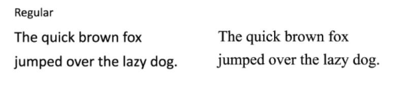
Secretary of State Marco Rubio has ordered diplomatic correspondence to stop using the Calibri font


 S E E D E D C O N T E N T
No joke

This AP headline above looks like something from The Onion. But it’s not :
WASHINGTON (AP) — Secretary of State Marco Rubio has ordered diplomatic correspondence to stop using the Calibri font and return to the more traditional Times New Roman effective Wednesday, reversing a Biden administration shift to the less formal typeface that he called wasteful, confusing and unbefitting the dignity of U.S. government documents.
“Typography shapes how official documents are perceived in terms of cohesion, professionalism and formality,” Rubio said in a cable sent to all U.S. embassies and consulates abroad Tuesday.
In it, he said the 2023 shift to the sans serif Calibri font emerged from misguided diversity, equity and inclusion policies pursued by his predecessor, Antony Blinken. Rubio ordered an immediate return to Times New Roman, which had been among the standard fonts mandated by previous administrations.
Times New Roman is simply more dignified, Rubio’s memo argues.
“Aligning the Department’s practice with this standard ensures our communications reflect the same dignity, consistency, and formality expected in official government correspondence.” “Dignity” appears mutliple times in the memo.
Rubio attends Cabinet meetings where a president with an epic comb over and orange tanner expects him and others to lick his boots while he nods before returning to an office he redecorated to look like a bordello.
ABC News leads its report, tongue firmly in cheek, with “ There’s a new serif in town! ” The memo requires official State documents printed in 14-point font. If that’s to make them easier to read, isn’t that just the “accessibility” Rubio’s memo decries?
 Image via State Department.
========================================
“So, to restore decorum and professionalism to the Department’s written work products and abolish yet another wasteful DEIA program, the Department is returning to Times New Roman as its standard typeface.”
Nothing says Trump like decorum and professionalism.
Tags
Who is online
117 visitors
Who knew that a type style could be "woke" ?
It should be "The quick brown fox jumps over the lazy dog." The expression is meant to use every letter in the alphabet, and "jumped" omits the "s" from the sentence. If I were ever to write to Marco Rubio, I would purposely use Comic Sans MS font.
I use the Calibri font or Arial Narrow. The letters I send out are packed full of stuff and Calibri or Arial Narrow allows me to pack more stuff on one page instead of wasting another page.
The above paragraph has nothing to do with the topic, sorry, John
This is just another useless distraction to keep people from looking in the corners
Its hilarious to see someone in the Trump administration complain about lack of dignity.
Gee.... it sure is good to see that our "leaders" are taking care of the IMPORTANT stuff....
Everything these jackasses don’t understand is “woke” or “DEI.”
I don’t know specifically why they were using Calibri, but I bet there was an actual reason.
There have been a lot of studies done on communicating and fonts. Typically, if something is in print, a serif font like Times New Roman makes it easier to read. But for electronic communications - i.e., something you would read on a screen - sans serif fonts are easier to read.
So if you’re the Secretary of State, and you actually give a shit about communicating with people and getting them to read and understand the bullshit you distribute every day, you pick a font that does the job better.
I like Calibri because I can set the size to 11 and still get everything on one page. Times New Roman forces me to go below 10 and then everybody needs a magnifying glass to read it
I prefer sans serif of any kind. Serif fonts look antique.
This administration should just use whatever font MAD magazine uses.